Thursday, December 16, 2010
Friday, December 10, 2010
Bartol Pasta & Magazine Ad
Here is a magazine ad that I just finish designing. It is for the pasta box that I designed along with the logo.
Monday, December 6, 2010
Team Santa Tshirt
Here is a logo that I designed for a class project.
I am looking into having these printed. Send me an email if you are interested.
Happy Holidays! Go Team Santa!
Friday, December 3, 2010
Thursday, December 2, 2010
Thursday, November 18, 2010
Candle & Fruit
This is a work in progress...the lighting around the candle and lower candle are killing me. I think I just need to step away for awhile.
Saturday, November 13, 2010
Kiss the Abyss Movie Poster
This is the movie poster that I did for my brother Eric's movie...check out the trailer. Here is the link: http://www.youtube.com/watch?v=UQWO2GZjhKQ
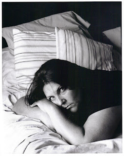
Photo Project 2

This had to have been the toughest project ever..... well, besides having to stare at my self and paint my self portrait. I must have shot at least 6 rolls of film. We had to set the the photos and have someone else take them for us...the problem is, I am use to being behind the camera, not in front. These were the only two that I liked of just me...the funny thing is, I shot both of these by myself, using the timer. I guess I could just be more myself, when I was shooting my own photo. I will have to post the two other photos of this project when I get them back from my instructor. I also had to shoot a self portrait without me being in the picture. A composed image that represents me, and also a self portrait of me as a character.
You will have to stay tunned to see those.
Photo Project 1
Close-up
Light
Motion
Edge Problem
I love shooting black and white film... it is so amazing how images can change in a different medium. The close-up image is my neighbors dining room chair. I just love this picture. Who knew a dining room chair could be so beautiful. The next image Light is also in my neighbors house (she has her house decorated beautifully) I like the way the light hitting the table looks almost like satin. The next image, motion, is a merry go round at the park. I shot a million pictures of this one, I had found some people at the park that were good sports and spun around on the merry go round until they were cross eyes. In the end I really like this one the best, because you couldn't really tell what it was. I think I was attracted to the blurred motions along with the circular lines and the texture of the ground. The last one, edge problem, was suppose to be an image without the focal point being in the center of the image, and the edges of the image needed to be interesting enough to draw your eye around the image. For this one I climbed on top of this jungle gym at the park, it is this sort of circular thing with a ladder/monkeybar thing going around it. The shadow on the texture of the sand was sort of interesting.
Wednesday, November 10, 2010
Sphere Crazy
The first sphere I did - oops! forgot to write down what i used???
I used splatter 46 brush for this one
I started to get into this by the third one. This one was done with a dark gray/blue background (underpainting) and I used brush: wet sponge - opacity 40/flow 20
This one was done with a deep red underpainting, brush: round fan stiff thin 25, opacity 23/flow 11. My husband Mark, challenged me to make a fluffy ball, I was thinking pom pom, he was thinking Sulley from Monsters Inc. as a ball???? Maybe next time.
This one was done with a yellow underpainting, brush: round angle low stiffness 46, opacity 43/flow59
This one that looks like you need a new prescription for your glasses, was done with the an airbrush 66 and a mix of opacities and flows.
Saturday, November 6, 2010
Friday, November 5, 2010
Technical Illustration Project
I am so glad this turned out as well as it did. I struggled so hard at the beginning of this project, but I finally feel that it all came together.
Friday, October 29, 2010
Thursday, October 28, 2010
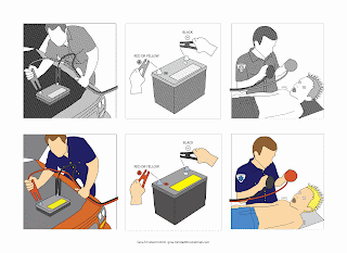
Technical Illustration - Photo Reference
Okay, so I thought it was me and I couldn't figure our how to do the contact sheet in Photoshop. (Even following the step by step instructions.) After a little investigating I found out that they do not have that function in CS5 anymore (bummer) I had to use illustration to lay it out. There is not much variation in the position of poses. I have a few other pictures I am going to play with that I found on the web.
These are my two sons Thomas and Matthew...they are GREAT sports. I especially love the pumpkin defibrillator paddles!
Thursday, October 21, 2010
Tie Your Shoe
This is our Tie Your Shoe assignment, it was pretty hard to do it with only four images.
(Katie, Patrick & Me)
Friday, October 15, 2010
Thursday, October 14, 2010
Thursday, September 30, 2010
Friday, September 24, 2010
Thursday, September 23, 2010
Friday, September 17, 2010
Thursday, September 16, 2010
Thursday, September 9, 2010
Wednesday, September 8, 2010
Studying Abstract Art
It reminded me of the doodles I use to do when I was a kid. This is great when you have block and can't seem to move forward.
Subscribe to:
Comments (Atom)


